


This was in line with expectations, so it did not move the markets.
The May nonfarm payroll numbers were up 138,000, not very good. But the unemployment rate dropped to 4.3%.
Wait. How is that possible?
Well, some people give up, so they are no long counted. If you were to count the number of persons who could be employed who actually have jobs, our unemployment rate would be much higher. That’s how you can add only half the jobs of a normal economy and still have the unemployment rate go down.
If the unemployment rate went down why did the average hourly wages only go up 0.2%?
If it was truly a tight labor market, wages would have been much higher.
Normally the first Friday of the month the JOBS JOBS JOBS report moves the market but this was a big yawn.
So a quiet week, and therefore interest rates remain the same.
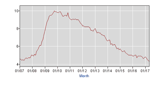
The 2 charts below (sourced from the BLS) are the unemployment rate numbers for 2007 through 2017, both as a chart and as a graph.
Unemployed means someone who did not have work in the previous week (the week of the survey which is conducted for them by the US Census Bureau), who is actively searching for, and can accept employment but is not employed.
As I mentioned earlier, people who have given up looking are not included in these numbers. However, even more bizarre is people who are laid off and waiting to return, are counted as unemployed and they may not be actively looking.
For example, I have a client who got laid off 18 months ago from his advertising job. He is 52 years old. He tried fervently to find a job in his line of work, but most jobs didn’t pay anywhere near his old salary (like HALF).
He took odd jobs and temp jobs, but after 18 months, decided to give up. He, and people like him, are no longer in the unemployment rate.
One might argue that the unemployment rate as announced by the Bureau of Labor Statistics (one of my favorites), is not accurate because of these factors.
| Year | Jan | Feb | Mar | Apr | May | Jun | Jul | Aug | Sep | Oct | Nov | Dec |
| 2007 | 4.6 | 4.5 | 4.4 | 4.5 | 4.4 | 4.6 | 4.7 | 4.6 | 4.7 | 4.7 | 4.7 | 5.0 |
| 2008 | 5.0 | 4.9 | 5.1 | 5.0 | 5.4 | 5.6 | 5.8 | 6.1 | 6.1 | 6.5 | 6.8 | 7.3 |
| 2009 | 7.8 | 8.3 | 8.7 | 9.0 | 9.4 | 9.5 | 9.5 | 9.6 | 9.8 | 10.0 | 9.9 | 9.9 |
| 2010 | 9.8 | 9.8 | 9.9 | 9.9 | 9.6 | 9.4 | 9.4 | 9.5 | 9.5 | 9.4 | 9.8 | 9.3 |
| 2011 | 9.1 | 9.0 | 9.0 | 9.1 | 9.0 | 9.1 | 9.0 | 9.0 | 9.0 | 8.8 | 8.6 | 8.5 |
| 2012 | 8.3 | 8.3 | 8.2 | 8.2 | 8.2 | 8.2 | 8.2 | 8.1 | 7.8 | 7.8 | 7.7 | 7.9 |
| 2013 | 8.0 | 7.7 | 7.5 | 7.6 | 7.5 | 7.5 | 7.3 | 7.3 | 7.2 | 7.2 | 6.9 | 6.7 |
| 2014 | 6.6 | 6.7 | 6.7 | 6.2 | 6.3 | 6.1 | 6.2 | 6.2 | 5.9 | 5.7 | 5.8 | 5.6 |
| 2015 | 5.7 | 5.5 | 5.4 | 5.4 | 5.5 | 5.3 | 5.2 | 5.1 | 5.0 | 5.0 | 5.0 | 5.0 |
| 2016 | 4.9 | 4.9 | 5.0 | 5.0 | 4.7 | 4.9 | 4.9 | 4.9 | 4.9 | 4.8 | 4.6 | 4.7 |
| 2017 | 4.8 | 4.7 | 4.5 | 4.4 | 4.3 |
Another good chart! So if the BLS says 7,000,000 (2007 number but same unemployment % as today) people are out of work, and that’s only 4.3% unemployment, then why do we know so many people who want and can’t find work… and why are the GDP and inflation still flat?
Should the engines be firing? Why is it, I see so many HELP wanted signs, so many opportunities around me and yet we have 7 million people unemployed…
Would love your thoughts!